ShopDreamUp AI ArtDreamUp
Deviation Actions


Description
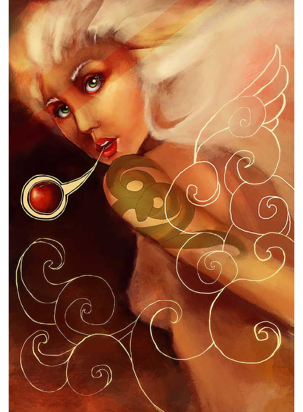
Eva fleeing Eden reminding us that it actually is vital to cross the line once in a while.
Damn i should have this one finished yesterday for women's day. Anyways, it's dedicated to all the Eva's out there not being afraid to break some rules but specially to my big sister best Eva of all.
Now on to the technical stuff. I used this photo from America's next top model (my summer guilty pleasure don't judge me") ) as a ref [link] Some photos and concepts are actually pretty cool. I learned a lot of things while painting this including never trust your ref pic pose yourself to see if it actually makes sense and that the only music i will actually get anything done is the Lola Rent soundtrack. Program Photoshop CS5 and my mousey (yes i'm posing cause i'm darn proud of this one)
) as a ref [link] Some photos and concepts are actually pretty cool. I learned a lot of things while painting this including never trust your ref pic pose yourself to see if it actually makes sense and that the only music i will actually get anything done is the Lola Rent soundtrack. Program Photoshop CS5 and my mousey (yes i'm posing cause i'm darn proud of this one)
WIPs are here [link] [link] .
Thank you for all the critiques!! And a really big thanks to *rejlan who was of so much help.
If you see anything wrong critiques are most welcome really. I'm submitting this for a local festival so wish me luck!
Damn i should have this one finished yesterday for women's day. Anyways, it's dedicated to all the Eva's out there not being afraid to break some rules but specially to my big sister best Eva of all.
Now on to the technical stuff. I used this photo from America's next top model (my summer guilty pleasure don't judge me
![[link]](https://www.deviantart.com/users/outgoing?http://www.google.gr/imgres?imgurl=http://farm4.static.flickr.com/3615/3428258292_c8f252273a.jpg&imgrefurl=http://www.flickr.com/photos/packzproductions/3428258292/&usg=__rprGLNtGjOLdOdzOZ4g_xYe9Qf0=&h=270&w=480&sz=39&hl=el&start=148&zoom=1&tbnid=QCObkDw1douQDM:&tbnh=99&tbnw=176&ei=JOl3TYDHH4W64Aadj62KCA&prev=/images%3Fq%3Dallison%2Bharvard%26um%3D1%26hl%3Del%26client%3Dfirefox-a%26hs%3DDvl%26sa%3DN%26rls%3Dorg.mozilla:el:official%26channel%3Ds%26biw%3D1366%26bih%3D575%26tbs%3Disch:10%2C2850&um=1&itbs=1&iact=hc&vpx=219&vpy=283&dur=486&hovh=168&hovw=300&tx=194&ty=106&oei=_Oh3TfGdHNS7hAf83oCWBg&page=7&ndsp=25&ved=1t:429,r:17,s:148&biw=1366&bih=575.)
WIPs are here [link] [link] .
Thank you for all the critiques!! And a really big thanks to *rejlan who was of so much help.
If you see anything wrong critiques are most welcome really. I'm submitting this for a local festival so wish me luck!
Image size
615x836px 355.09 KB
© 2011 - 2024 pixie-on-mushroom
Comments9
Join the community to add your comment. Already a deviant? Log In
You asked for some critique, so I'll get right down to it! Let me start by telling you that the colour and concept of the piece are lovely, and the textures are in fact very well done. I also like the overall, stylized look. However, in my book, there's a difference between stylization and flaws, so I'll be treating the painting as if a normal portrait for the rest of this comment.
And when I do so, I notice a few things right away. It looks like you used the reference loosely, and while that's okay normally, it can lead to problems when the pose is as strange as this one. When you compare it, you can see that you've angled the model away from the camera more, but by not twisting the back along with it, you've somehow removed part of her shoulderblade. This has also caused the arm to look a bit.. detached.
The other little mistakes I can see are more around the face area. In example, she doesn't have much of a forehead to speak of. While this makes sense in the reference picture (her hair is falling over the forehead), it doesn't make much sense here, since the direction of the hair indicates it's the base of it. Another issue is that her eyes seem a little far down. Finally, a little comment on the white lines: They seem overly.. squiggly. If it's hard for you to get smooth line with your mouse, you could try using the paths tool?
Don't get me wrong and think I'm trying to be offensive, I'm not. I simply think you could get much more out of this, and since you're cool enough to admit to using a reference and not trace it, you seem like someone who is trying to improve anyhow - and every little bit helps then!